Shop Tab Redesign on iOS App
Matches
Overview
Matches wants to redesign the look and functionality of the Shop tab on their iOS app.
Role
Product Designer
Platforms
Mobile iOS app
Skills
User research
UX/UI (using Figma)
Prototyping
Presenting
The Problem
The current iOS Shop tab does not meet accessibility standards, the carousel hides links to product listing pages and gift cards, and the hierarchy needs to be reorganised.
The Outcome
The page was signed off and put into development before the company went into administration.
Analysis of current Shop tab
-
Text is over images which is not accessible
-
Fairly long page pushing content down
-
Not clear what the new Fashion Feed is, and it could be positioned better
-
The Discover carousel at the bottom hides Edits and Gift Cards

Competitor Analysis
Key Takeaways:
-
Keep text outside of images
-
Section headings help introduce what the user is looking at
-
Consider different layouts for different sections of information
-
Small images are not helpful/don't add anything


Idea 1
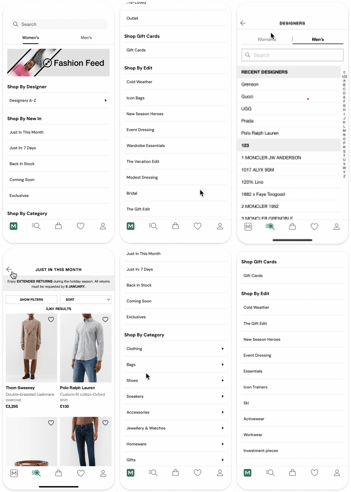
Text only button design
-
Search bar
-
Men's and Women's tabs
-
Promotional banner at the top
-
Headers for each section
-
Arrows on buttons that go to a second category list

Idea 2
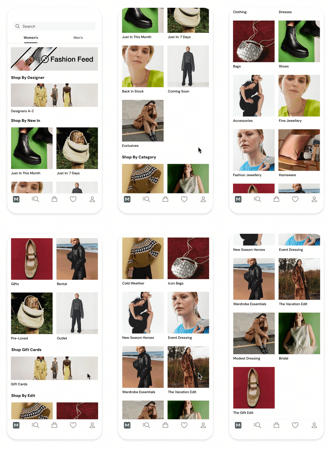
Image only button design
-
Search bar
-
Men's and Women's tabs
-
Promotional banner at the top
-
Headers for each section
-
Image buttons with text below

Idea 3
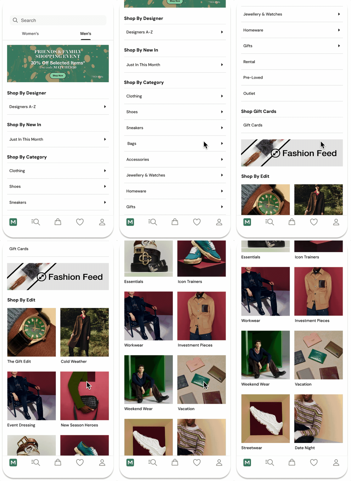
Combination of text and image buttons
-
Search bar
-
Men's and Women's tabs
-
Promotional banner at the top
-
Text buttons for Categories because these are self explanatory
-
Second promotional banner space added upon request
-
Image buttons for fashion Edits because these are meant to be inspirational

Next Steps
I presented my designs to the Product Manager of this project and the response was very positive. The takeaways were:
- How can we make Designers A-Z and Just In work as stand-alone elements without headers? Occasionally Menswear has just one Just In button whereas Womenswear has more Just In categories.
- The Trading Team also want to put Edits on the app homepage as well, so we discussed the idea of adding button chips.
Amending button design for 'Designers A-Z' and 'Just In'
-
Image buttons added for Designers A-Z and Just In This Month
-
Bolder text labels underneath to make them stand out
-
Inspirational and enticing

Adding Edit Chips to the Homepage
-
Chips sit just above the fold with title explaining what they are
-
We've agreed on 2-3 rows of chips
-
Chips can be rearranged to make rows look neater with less gaps
-
Component is scrollable and what always show that there are more by cutting off chips at the edge of the screen

In development
I presented my updated designs to the Trading Team who agreed on the UI changes. These designs were then passed on for development.