Just-In Carousel
Matches

Overview
Matches wanted to redesign the entire homepage. I was asked by a Senior Product Manager to analyse our current web and app homepages and suggest improvements.
Role
Junior UX Designer
Platforms
Web
App
Skills
UX
Wireframing (using Sketch)
Stakeholder negotiation
Presenting
The Problem
Improve homepage engagement by reducing content and adding more shoppable features.
The Outcome
A shoppable carousel was added to the web homepage, which has been a permanent fixture on the website since 2019 as an outcome of this project.
How we got there
The process

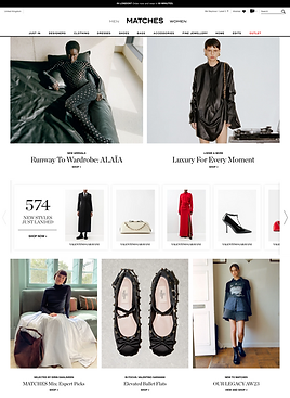
Analysis of previous Matchesfashion
homepage
Much of what we produce on the homepage goes untouched (or worse, unseen).
Our current UX doesn’t encourage users to engage with our content as much as it should.

Competitor analysis
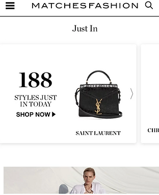
From doing competitor analysis I saw some innovative shopping carousels. Here are a few examples.
I pointed out 'It instills an impulse to buy from fear of missing out, and helps with purchase decisions as you can see what is trending'.

New In carousel

New in product carousel

New arrivals product carousel
New In carousel
Matches App
I also looked at our app to analyse any differences and found that we already had a shopping carousel on the app, we just weren't surfacing it on desktop. So I asked a Data Scientist for analytics on how well it performs.
Analytics
I found out that shopping-related features (i.e. features that encourage you to visit a listing page or in some way engage with our products) perform much better than “content” related features, and backed this up with data showing '24% of our customers would like to see more outfit inspiration and 20% would like new trend information'.

How might we?
Produce an engaging shopping carousel for the web and where should it be placed so that we capture our customer attention early.
Initial ideation
I sketched out an example of what the shopping carousel could look like and where it should be placed. I also suggested, adding heart icons in the corner of each item so customers can quickly add them to their wishlist, and placing it above the fold on our homepage.
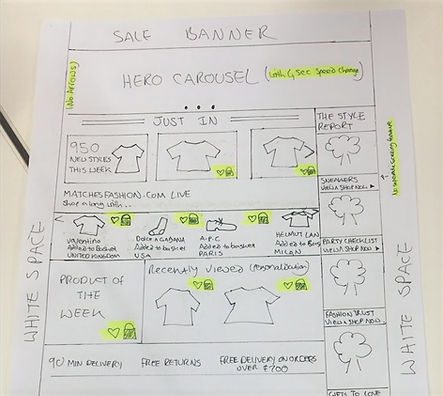
Next I made a wireframe of my sketched idea for desktop. We were also exploring ways to make the homepage more personalised hence the welcome message.
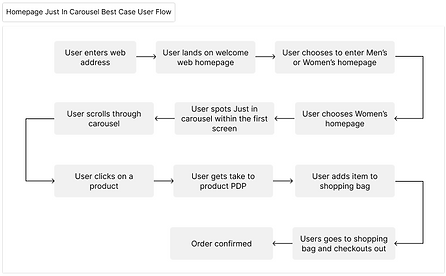
User flow
Next I mapped out multiple user flows to try and understand the advantages and disadvantages of adding a shopping carousel to the homepage. Here is one example.
Build phase
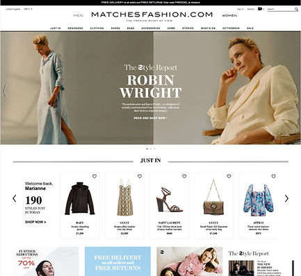
As a result, the Senior Product Manager decided to put the Just In Carousel on the web homepage to do an A/B test.
Success metrics
The initial results were promising showing double the engagement with homepages, and generated £10.8 million pounds in just 21 days
My team were delighted by the results and sent me some wonderful feedback.
Matchesfashion promptly made this a permanent feature on the Men's and Women's homepages, and it is still live today.


