Improving PDP Images
Matches

Overview
The UX team was asked by the Studio team to research how we could improve our product display page (PDP) images.
Role
Junior UX Designer
Platforms
Web
Skills
Competitor research
User interviews
Prototype building (Axure)
Presenting
Teamwork
The Problem
Matches wanted to update and modernise its product imagery to keep up with competitors and better engage new and existing customers.
The Outcome
The Studio team took on board our findings and implemented our suggestions when shooting new imagery. The response from the business was very positive.
Problems with previous imagery
-
Outdated white background on cut-outs
-
Inanimated model poses
-
Inanimated catwalk videos
-
Outdated background colour
-
Lack of close up details


Competitor analysis
From doing competitor analysis we saw interesting background choices, poses, close ups, accessory usage, and models with and without faces.


Prototype
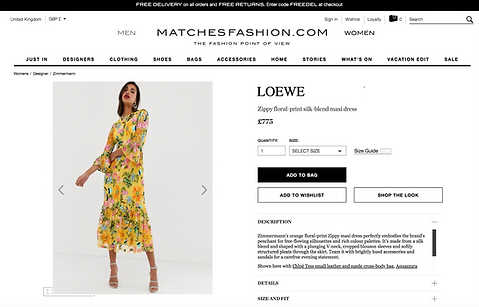
First, we started by taking screenshots of images from competitor websites and overlayed them onto Matchesfashion PDPs so that interviewees would not know the difference.
For example, this image shows an Asos product image on top of the Matches PDP.
User interviews
Next, we conducted video interviews with 5 female customers and asked them for their opinion on which images would entice them to buy the item.
We asked open questions such as:
-
How do you feel about the model's pose?
-
What do you think about the background?
-
How do you feel about not seeing the model's face?
-
What do you think about the close up shot?
-
How do you feel about the accessories?
-
What do you think about the video?


Testing new Matches imagery
We were given test imagery from the Studio team, which we displayed next to our old imagery and a competitor example (without the labels to make is unbiased). We asked which image users preferred and why.
Here is an example of the responses, regarding shots of a pair of jeans.


Findings
Customers prefer:
-
White/brighter backgrounds
-
Not seeing the model's face because it makes it easier to see yourself in the item
-
Less accessories to let hero items shine
-
To be able to zoom in with mouse over
-
To see the front shot first, then side-shots, close-ups etc.
-
The same item styled differently to show versatility
-
The video to show key features
Project success
We presented our findings to the Studio team, who took them on-board and implemented our suggestions. The response from the business was very positive.
Since then, Matches has completely overhauled all product listing page imagery to follow this new approach.
